Trailer
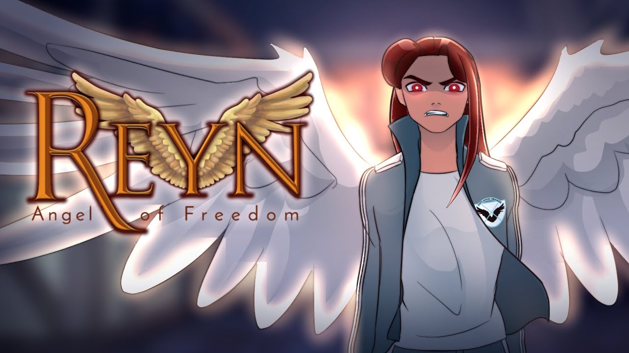
The film is done! I put together this trailer for our promotion.

Compositing
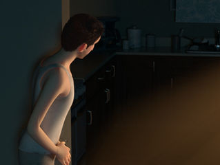
This week's featured shot is by far my favorite of the entire film. I experimented with depth by making Saul rather dark compared to the bright light behind him, utilizing god rays for a more meaningful effect. This blog won't allow multiple files, so you'll have to wait for the full film to see the other composited shots!

Compositing and Sound
I composited and color corrected shots from the last portion of the film. Unfortunately, this blog can't handle too many videos, so I picked my favorite from this week. I also created a temporary soundtrack to help us communicate with our sound designer about what we have in mind for our music.

Lighting
Working on lighting the final scenes of the film with a bright, volumetric light. Of course, the god rays are a must. I also composited another handful of shots.

Lighting
This week marked the completion of our art book. Besides that, I have been compositing together the rendered shots, and continued lighting the scene. I realized that my earlier version of one of these scenes was lit by a warm light, but it should actually have been cool blue moonlight. Blending the blue and yellow together without the colors turning muddy was a challenge. I also experimented with the harshness of the dove's light. If it's too soft, it looks too weak. If it's

Lighting
This week's focus was heavily on lighting and figuring out the look of the film. We decided that the light of the dove will be a little cooler than we initially planned, because the bright yellow glow made it seem like it was mid-day, whereas we are going for the feeling of a new beginning.

Lights
I continued lighting the last sequence and experimented with the color correction and final look. We have to be careful about the dark colors in our film because they easily look to contrasted on larger monitors. I also helped out another film in our studio, "Moonseed," with lighting one of their scenes. I composited a handful of shots from the first sequence.

Poster and Light
I worked on a concept for our final poster, focusing on Saul and the spirit. I also continued lighting the scenes. We decided on a living room design with more interesting colors, using a cool blue to offset the murky yellows.

Lights and Colors
After turning on the lights in the living room, we realized that the colors no longer looked appealing. there was little sense of design, and most of it looked harmonious solely because we used the same limited color scheme for most objects: tones of murky yellow and brown. We redesigned the living room, adding elements to guide the eye throughout the scene.